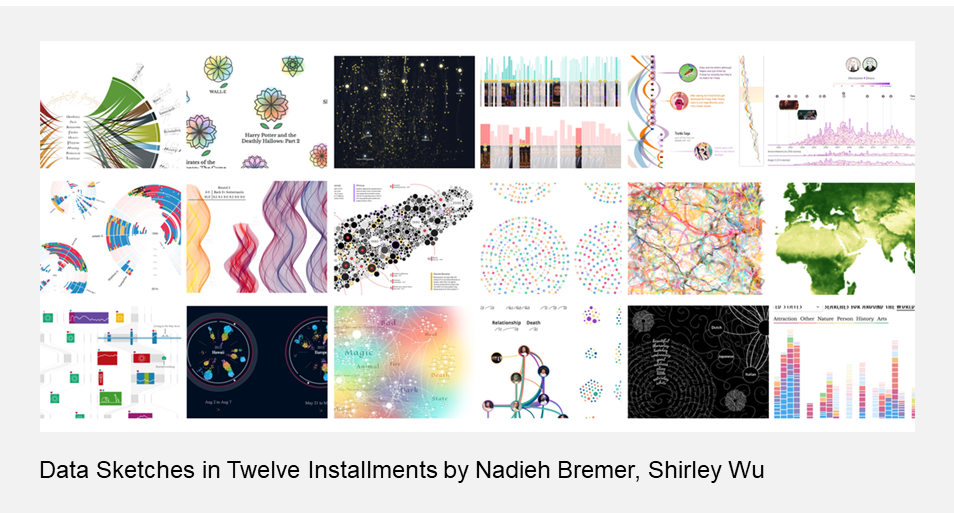
Blog
Choosing colours for your charts? There’s more to it than you might think
Jon Geraghty, dunnhumby’s data visualisation expert, looks at how more thought goes into displaying data than one might realise.
Artists and designers have been exploring and using colours for centuries and a lot of thought can go into using the right colours – whether it is setting the mood for an illustration, drawing the eye, or maybe building up a brand association. Because our brains are hardwired to notice when things are a different colour, it can be a useful element in our data storytelling.
But picking the right colours isn’t always that straightforward, especially when it comes to presenting the impactful customer data insight we do at dunnhumby. Selecting aesthetically pleasing[1] colours, or simply making charts using our existing brand palette may not be the best choice if we want readers to find insights in our data, or to quickly understand a visual we’re presenting.
Why colours are so useful in data visualisation
We humans are visual creatures, with a large proportion of our brain’s neurons dedicated to processing what our eyes see, and we are also great at remembering images with a good degree of accuracy. As part of the subconscious visual process, our brain very quickly scans for what are called pre-attentive attributes – things like contrast, position, size and differences in colour.
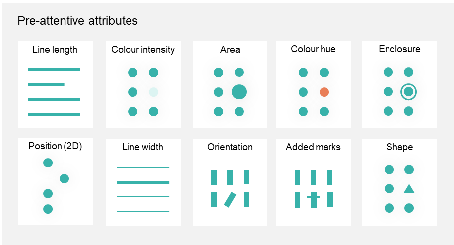
Seeing as we are so good at it, it makes a lot of sense to visually encode aspects of our data using these attributes, allowing our brains to quickly identify patterns and notice things that stand out.
Colour can be used to represent the magnitude of some data, as we might see in heatmaps or conditionally formatted data tables, but it is particularly well suited to distinguishing different groups or series of data – be they segments in a pie chart, time-series lines, or stacked bars.
What is a colour anyway?
Up until now I’ve just been using the term “colour” in a loose sense. I won’t go into the physics of light reflection here, but there are a few different ways, or models, we use to specify any given colour. A common one, which is especially handy for us in data viz terms, is HSL or Hue-Saturation-Lightness:
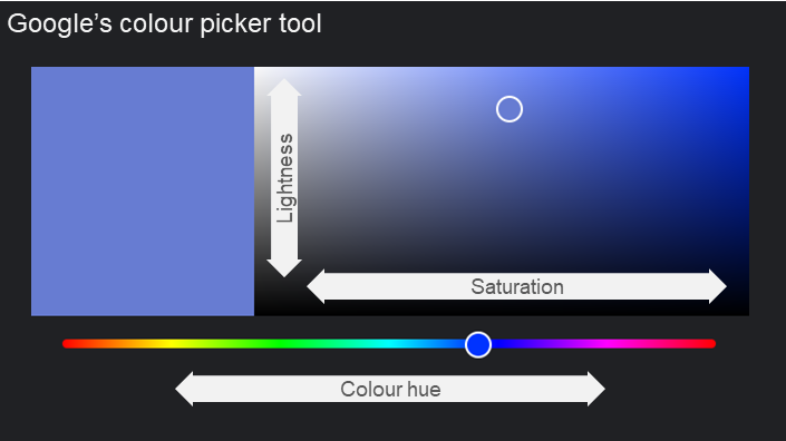
- Hue – where on the colour wheel does it sit.
- Saturation – how “strong” that colour is, with grey/black/white being completely desaturated.
- Lightness – is it light or dark. Also known as luminance, brightness or value.
These dimensions can be used in some combination as attributes within a chart, such as in these examples:
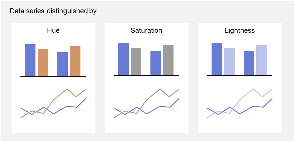
In each of these column and line charts I’ve altered only one of the colour dimensions at a time, keeping the others identical. Some work better than others and we should use a combination to generate a good amount of contrast for our readers.
How we choose the right colours
I mentioned it’s not straightforward to pick colours for visualisation and that’s because there are a few things we should consider.
- Utility – colours should help insight leap off the page or screen
Most importantly when it comes to visualising data, we need to ensure the colours are helping our reader to understand the chart. We use colours to distinguish different data series, and to draw the eye to insights we want our readers to focus on.
- Accessibility – use colours that work for all readers
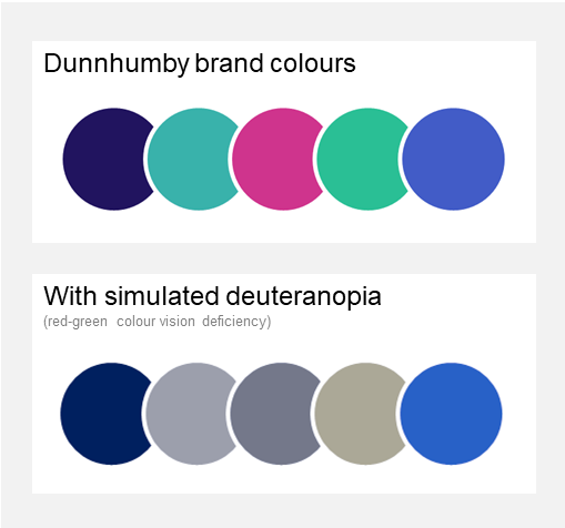
For people with full colour vision it can be hard to appreciate that some readers may have difficulty discerning certain colours or seeing small changes in contrast. Some degree of colour-vision deficiency, such as Deuteranopia (difficulty telling reds from greens), affects around 1 in 12 men. Accessible design is, thankfully, becoming more and more of a hot topic and something we need to consider.
- Aesthetics & brand – readers engage more with beautiful charts
While we could focus our colour palette on the most effective and safe colours to facilitate understanding, we also need to factor in that aesthetic beauty does impact how readers will engage with and trust what we show. And as we’re often presenting visuals as part of a wider branded piece, such as a report or dashboard, we don’t want colours to look out of place.
- Familiarity – be aware of conventions
Finally, we need to consider any conventions and colour associations our readers might already have. A common one being red/green to indicate negative or positive values – tricky given accessibility challenges mentioned above! – but we’ve also built up a colour language at dunnhumby where certain KPI metrics are always associated with a particular colour. There was quite the backlash when we absent-mindedly swapped some of those KPI colours during one product design update, which we hurriedly rolled back.
How we do it at dunnhumby
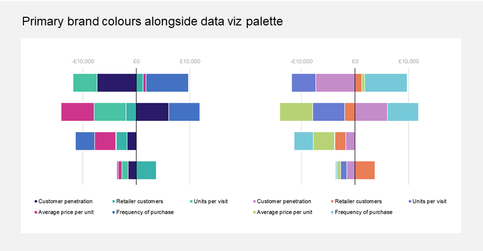
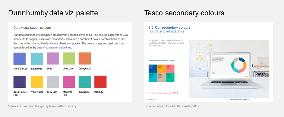
As you’ve seen in the image above, our harmonious brand palette is not always ideal for the purposes of making charts with more than a couple of colours. To get around this problem we’ve adopted a secondary colour palette, solely for use in data visualisation.
It’s not an uncommon practice, Google’s Material Design system recommends adding additional colours to represent data, and UK Retailer Tesco have defined an entirely separate colour palette for this purpose.
You can probably get away with using your primary brand colours for no more than three distinct series in a chart, but as soon as you’re going larger than that – eg multiple lines on a time series, or segments of a stacked bar chart – you’re best off utilising an entirely separate set of colours to help those data insights leap off the screen.
Hopefully I’ve shown that something seemingly as trivial as picking a few colours for your data viz can be more involved and there are quite a few things to consider.
As a closing note, my advice when it comes to picking colours for your charts and visuals? Use colours minimally and with purpose.
[1] ‘Pleasing’ is a subjective term. There are theories and guidelines about attractive or harmonious colour combinations, and how some colours might illicit emotional reactions – we don’t eat blue food, red/yellow might mean danger, etc – but at the end of the day maybe your reader just doesn’t like a particular colour. I distinctly remember a first bit of user feedback on one app prototype we were testing: “I don’t like that orange”.
Insights
The latest insights from our experts around the world